Bikon
The Bike Matrix Bikon. This is best used in a website's header. It allows the user to call the Bike Matrix Application from wherever they are in the website. A green tick will appear if a bike has been selected.
Props:
data-color
Collection Result
Bike Matrix Collection Result. Used on the Product Card when viewing a collection of products. On a collection of brake pads this would appear on each of the product cards to give the user a quick view of each part's compatibility.
Props:
data-product-id
data-product-skus
Bike Selector Banner
The Bike Matrix Bike Selector Banner. Used in place of or as well as the Bikon. Has an onClick which will call the Bike Selector Modal.
Props:
data-title
data-color
data-font-color
data-full-width
Boolean value to have the banner floating or full width of the page.
Compatible List
The Bike Matrix Compatible List. A list of all products in a category which are compatible with the selected bike. Used at the top of a collection/category page in order to show push only compatible products to the top. Can be hidden by the user using the arrow toggle.
Props
Has its own config file which needs to be added in a script tag.
Has default styling for the product card however users are able to add their own template using slots. There is an example of this in the documentation for this component.
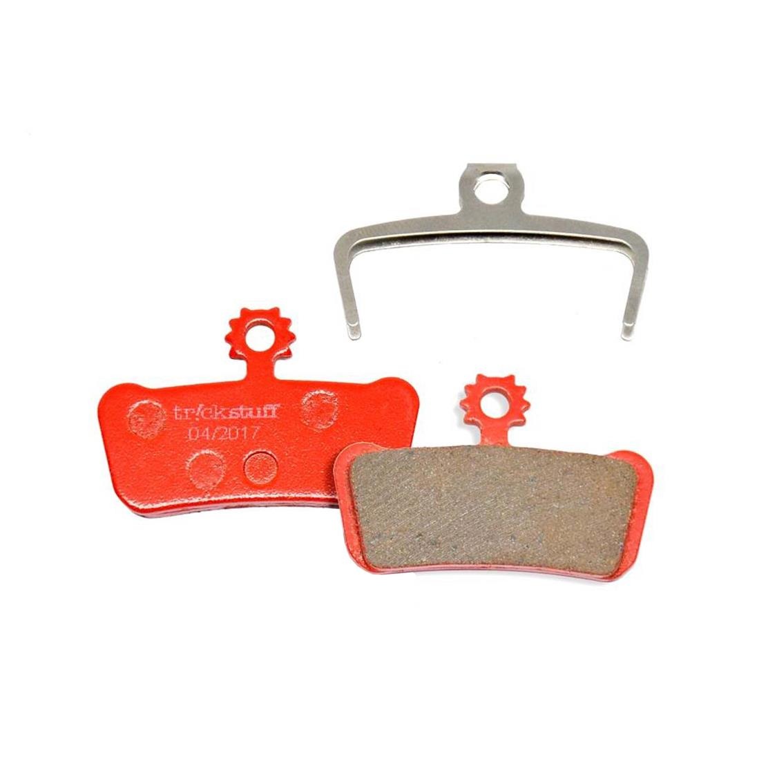
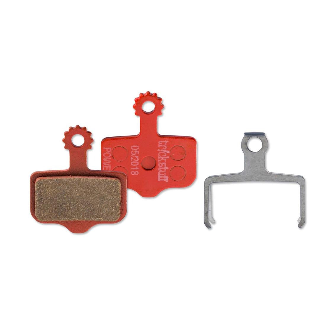
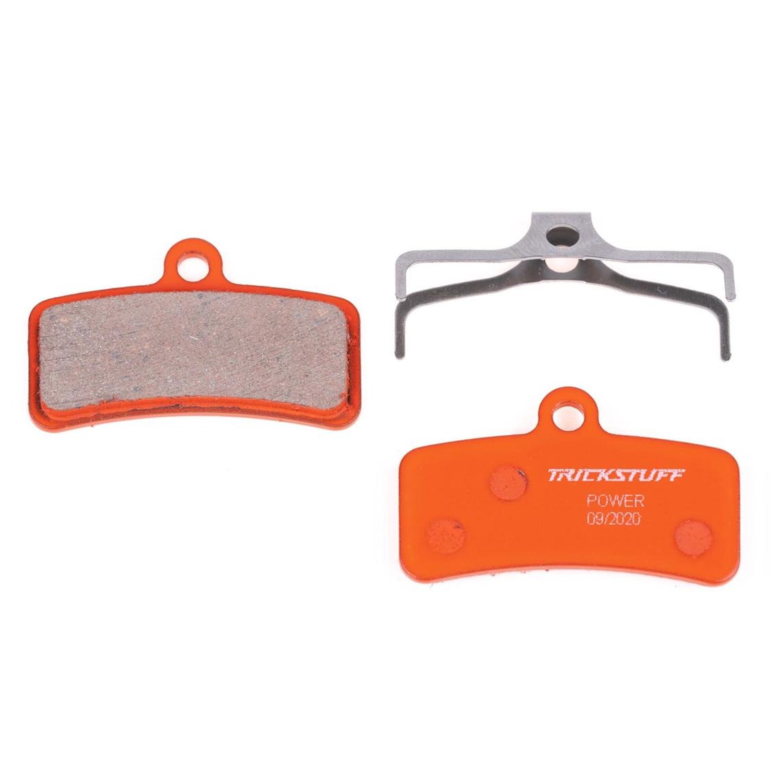
Trickstuff Power Brakepads
If you're lacking bite.
Our POWER brake pad gives you the necessary bite when you need it most. On exposed switchbacks, in the steepest chutes or just before the jump (that's perhaps a bit sketchier than you first thought) the POWER pad with its impressive braking power and fading stability offers you the precision to stay in control even in the most critical moments, and has enough power for you to master new challenges and savor the thrill to the fullest.
Product Result
The Bike Matrix Product Result. Used to indicate the compatibility of the specific product on its individual page. Best placed as close to the Add/Buy button as possible. The user is also able to call the Bike Matrix App by clicking the Product Result.
data-sku